前言
1.自适应内部元素
假如实现以下布局,要求图片下面的文字的自适应图片的最大宽度,并且图片是可变的,可能你会想要设置一个固定的max-width宽度值应用于包含图片的父容器,但是这就不是自适应了,在CSS3中我们有了一个新的单位min-content,它特指容器内最小的元素的宽度值,在这里是图片宽度。
css代码如下:
figure {
    max-width: 300px;/*浏览器回退*/
    max-width: min-content;
    margin: 0 auto;
}

figure > img { max-width: inherit }
但是支持的程度还不够,IE全蹦。
2.精确控制表格列宽
表格布局在以前很流行,但是由于其不可控逐渐被淘汰,但在CSS2.1中有一个属性,叫做table-layout,其默认值是auto,其行为模式被称作自动表格布局算法,并且它还支持另一个关键字fixed,他把gen更多的行为h控制交给了网页开发者,所以溢出行为等等都是有效的。
table{
    table-layout: fixed;
    width: 100%;
}
table td+td{
    width: 30%;
    overflow: hidden;
    text-overflow: ellipsis;
    white-space: nowrap;
}
<table>
<tr>
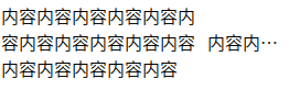
<td>内容内容内容[...]</td>
<td>内容内容内容内容[...]</td>
</tr>
</table>
3.根据兄弟元素的数量设置样式
有时候我们需要根据列表的多少设置一些特定的样式,比如当列表只有四个元素的时候我们将设置一种新样式,当列表只有一个元素,我们设置这个样式占满整个列表,那要怎么实现这种CSS选择器呢,有以下代码:
li:only-child{
    /*...*/
}
这段代码显示当且仅当只有一个子元素的时候应用样式,其实这不过是first-child:last-child的语法糖,道理很简单,既是第一个又是最后一个,那肯定只有一个元素了,我们依照这样的原理,我们有以下代码:
li:first-child:nth-last-child(4){
    /*...*/
}
这段代码最终将解释为:选择第一个子元素并且是倒数第四个元素。这似乎接近我们的效果了,我们的效果是满足四个元素子元素将全部应用一种样式,这里我们选择是第一个子元素并且满足四个元素的前提,下面我们只需要将剩余的3个元素选中即可,代码如下:
li:first-child:nth-last-child(4),
li:first-child:nth-last-child(4) ~ li{
    /*...*/
}
最终我们达到我们的效果了。
如果我们想要选中满足大于4个子元素并设置所有样式那该怎么做:
li:first-child:nth-last-child(n+4),
li:first-child:nth-last-child(n+4) ~ li{
    /*...*/
}
这里面的n将会从0开始迭代,所以将会匹配满足4,5,6等子元素的情况。
-n+b还可以匹配满足开头b这样的元素:
li:first-child:nth-last-child(-n+4),
li:first-child:nth-last-child(-n+4) ~ li{
    /*...*/
}
如果将上述两种结合起来,我们还可以匹配到满足包含2~6个元素的列表项:
li:first-child:nth-last-child(n+2):nth-last-child(n+6),
li:first-child:nth-last-child(n+2):nth-last-child(n+6) ~ li{
    /*...*/
}
3.垂直居中
可能初学CSS你第一百度的问题就是如何垂直居中,因此将在这里一一探讨各种方法。
- 基于绝对定位的解决方法
- 兼容 IE6+
- 优点 兼容性极好
- 缺点 代码耦合,需要定宽高
代码如下:
div{
    position: absolute;
    top: 50%;
    left: 50%;
    margin-top: -3em;
    margin-left: -9em;
    width: 18em;
    height: 6em;
}
这段代码通过绝对定位,将元素偏移到左上50%的地方,此时将是垂直居中的状态,继续设置其宽高,此时将以左上角垂直居中的点为扩展向右下扩张,所以需要通过margin将其左上方向再次偏移宽高的一半,从而达到垂直居中的效果。
- 基于绝对定位的解决方法(升级版)
- 兼容 IE9+
- 优点 代码简洁
- 缺点 代码耦合,需要定宽高
代码如下:
div{
    position: absolute;
    top: calc(50% - 3em);
    left: calc(50% - 9em);
    width: 18em;
    height: 6em;
}
通过使用calc属性,省去不必要的代码。
- 基于绝对定位的解决方法(最终版)
- 兼容 IE9+
- 优点 代码简洁,不用定宽高
- 缺点 无法兼容IE8
代码如下:
div{
    position: absolute;
    top: 50%;
    left: 50%;
    transform: translate(-50%, -50%);
}
- 基于绝对定位的解决方法(PC兼容版最佳实践)
- 兼容 IE6+
- 优点 代码简洁,不用定宽高
- 缺点 需要绝对定位
代码如下:
div{
    position: absolute;
    left: 0;
    right: 0;
    bottom: 0;
    left: 0;
    margin: auto;
}
通过使用绝对定位元素上下左右偏移设置为0,使其在水平和垂直方向都具有流动性,最后margin将从水平和垂直方向平分剩余空间。
- 基于视口单位的解决方法
- 兼容 IE9+
- 优点 代码简洁,不用定宽高,不用绝对定位
- 缺点 无法兼容IE8
在css3中,定义了一些新的单位,vh,vw,vmin,vmax,1vh等于视口高度的1%,也就是100vh等于视口的100%,vmin,vmax分别去视口单较小值和较大值,于是我们有以下代码:
div{
    width: 18em;
    margin: 50vh auto 0;
    transform: translate(-50%);
}
- 基于Flexbox的解决方案(移动端最佳解决方案)
- 兼容 IE9+
- 优点 代码简洁,不用定宽高,不用绝对定位
- 缺点 无法兼容IE8
Flexbox就是正对这个需求而被设计出来的,所以其便捷与简单性简直是开辟一个新天地,代码如下:
body{
    display: flex;
}
div{
    margin: auto;
}
看,就是这么简单,只需要一个容器设置flex布局,然后设置margin,它就会自动垂直居中,当然我们也可以不用容器,代码如下:
div{
    display: flex;
    align-items: center;
    justify-content: center;
    width: 18em;
    height: 10em;
    margin: auto;
}
通过align-items设置垂直居中,使用justify-content水平居中,最后使用margin均分剩余空间达到垂直居中效果,实在是美滋滋。
其它居中方法,可自行百度,这里不推荐:
- 行内文本垂直居中(近似垂直居中)
- 表格布局法(兼容性还可以)
4.紧贴底部的页脚
当我们的页面内容比较少的时候,我们可能想让页脚一致在底部固定显示,而不是跑上去,像这样:
我们期望这样,当内容少的时候,页脚显示在底部,内容多的时候,页脚跟在主体内容后面:
解决方案一
利用margin-bottom负偏移值进行偏移,类似于从主体内容切割一部分出来作为页脚使用,然后再通过伪元素设置相同高度从而撑开页脚高度,具体代码如下:
<div class="page-wrap">
  Content!
</div>
<footer class="site-footer">
  I'm the Sticky Footer.
</footer>
html, body {
  height: 100%;
}
.page-wrap {
  min-height: 100%;
  /* equal to footer height */
  margin-bottom: -142px;
}
.page-wrap:after {
  content: "";
  display: block;
}
.site-footer, .page-wrap:after {
  height: 142px;
}
.site-footer {
  background: orange;
}
缺点太多,代码太多,margin和高度耦合,还要百分比设置。
解决方案二
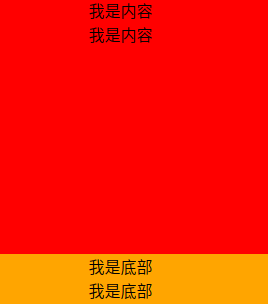
table布局,通过table布局自动充满剩余容器空间方法,代码如下:
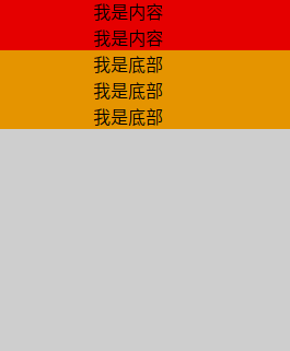
<div class="container">
    <div class="content" >
        <p>我是内容</p>
        <p>我是内容</p>
    </div>
    <footer class="footer">
        <p>我是底部</p>
        <p>我是底部</p>
        <p>我是底部</p>
    </footer>
</div>
.container {
    display: table;
    width: 100%;
    min-height: 100%;
    background:red;
}
.content {
    display: table-row;
    height: 100%;
    background:orange;
}
似乎比第一种方案简单了许多,但是通常margin、padding、border 等属性不会符合预期表现,解决方法就是样式别写在table上。
解决方案三
绝对定位,这个一看就懂,直接看代码:
<div class="container">
    <div class="content" >
        <p>我是内容</p>
        <p>我是内容</p>
    </div>
    <footer class="footer">
        <p>我是底部</p>
        <p>我是底部</p>
        <p>我是底部</p>
    </footer>
</div>
html, body {
    height: 100%;
}
.container {
    position: relative;
    min-height: 100%;
    padding-bottom: 50px;
    box-sizing: border-box;
}
.footer {
    position: absolute;
    bottom: 0;
    height: 50px;
}
缺点很明显,高度和padding-bottom耦合,还需要设置html, body的高度100%显示。
解决方案四
calc解决:
<div class="container">
    <div class="content" >
        <p>我是内容</p>
        <p>我是内容</p>
    </div>
    <footer class="footer">
        <p>我是底部</p>
        <p>我是底部</p>
        <p>我是底部</p>
    </footer>
</div>
.content {
    min-height: calc(100vh - 50px);
}
.footer {
    height: 50px;
}
代码简单,兼容IE9以上,在不考虑兼容性的时候可以考虑,但是高度依然耦合。
解决方案五
Flexbox解决,代码如下:
<div class="content" >
    <p>我是内容</p>
    <p>我是内容</p>
</div>
<footer class="footer">
    <p>我是底部</p>
    <p>我是底部</p>
    <p>我是底部</p>
</footer>
body{
    display: flex;
    flex-flow: column;
    min-height: 100vh;
}
.content {
   flex: 1;
}
这个是移动端最佳实践,PC端需要IE11以上。